8% increase in form completion rate


Overview
Product Designer
Role
Team Size
2 Years
Timeline
As part of a strategic initiative to improve conversion and customer engagement, stakeholders prioritized the redesign of the test-drive journey, focusing on consistency, usability, and platform modernization.
As the sole Product Designer, I led a full redesign of the end‑to‑end experience, collaborating closely with stakeholders, developers, markets and multiple product teams.
The redesign resulted in a higher completion rate, a unified experience across all touchpoints, and an updated design system.
Project under NDA: This case study is based on my work on a global forms ecosystem. To respect confidentiality, all information is shared at a high level. Visuals used in this case study are taken from the live product. Some visuals in the case study are intentionally blurred.
Desktop recommended: To enjoy the layout and visuals as intended, please view this portfolio in desktop mode.
Let's talk impact
• Delivered an 8% uplift in form‑completion rate year‑over‑year by improving UX clarity, strengthening visual hierarchy, and redesigning internal form components.
• Reduced time-to-submit the form by 6 seconds.
• Improved user satisfaction based on post-test feedback.
• Accessibility enhanced to meet WCAG 2.2 requirements.
• Fewer support tickets from markets due to better documentation and pre-configured content blocks.
• A new centrilized Forms Design Library in Figma.
• More consistent customer experience across all project touch points.
The Challenge:
Untangling a Fragmented System.
“The forms had evolved into a complex patchwork built on legacy architecture, dependent on multiple teams, and composed of highly configurable building block components…”
The main challenges included:
Conversion rate
Legacy Architecture
Cross-Team Dependencies
Global Market Variations
Fragmented Configuration Tools
Regulatory Constraints
Update to New Brand Design
Step 1:
Strengthening the Core Experience
As a first step, I immersed myself in years of:
User research
Market insights
Customer‑journey data
Past implementations
Team dynamics
The goal was to identify the foundational issues within the form before addressing the broader ecosystem.
Model Selector:
Reducing Immediate Cognitive Overload
“Displaying the entire model structure upfront created immediate cognitive overload…”
Forms journey before and after the redesign side by side.
Before
• Overwhelming initial text load.
After / Outcome
• Refined first‑level content to surface only essential information, using progressive disclosure to keep the interface clean and focused.
• Poor visual hierarchy. Important content pushed below the fold.
• Optimized visual hierarchy. The previous layout lacked clear prioritization, so I restructured the page, reduced the oversized header, and brought key content above the fold, allowing all essential information to fit within the viewport and act as a quick, scannable preview.
• Custom components used exclusively in this section of the website.
• Applied the filter‑tag component in the Fuel and Gear sections and used core component for the model selection to align with existing site patterns, reinforcing users’ mental models and creating a more consistent experience.
• The page was based on an older design language
• The page was redesigned accordiong to the New Brand Design.
Appointment Selector:
Fixing Legacy Interaction Patterns
“The component’s behavior did not follow common interaction patterns users expect from modern booking systems…”
Compare the previous (right) and redesigned (left) page by dragging the slider.
Before
• The interface was visually cluttered and the flow was confusing.
After / Outcome
• Improved the flow of the page, so users have a predictable and intuitive interaction.
• After selecting a date, time slots appeared above the calendar, breaking the user’s scanning flow and making them easy to miss.
• Time slots now appear directly below the selected date, matching natural top‑to‑bottom scanning patterns and significantly improving discoverability.
• React component for the calendar had styling and accesibility issues that needed to be fixed.
• Collaborated with devs to adapt an existing React calendar component, despite its limitations, to match product’s visual identity and interaction patterns.
• The time‑block selection created a misleading interaction. Users had the possibility to choose 1‑hour units with the option to extend into multi‑hour slots.
• Simplified options into broader time windows, that are easier to comprehend by the user.
• Clarified that users select a preferred time window, not a confirmed appointment.
• Displayed availability did not reflect actual dealership schedules, and this was not clearly communicated to users.
• Reworked UX copy and labels to set accurate expectations.
Contact Information:
Cleaning Up the Contact Experience
Compare the previous (right) and redesigned (left) version of the page by dragging the slider.
Before
• The page used an inconsistent mix of one and two‑column layouts, markets misconfigured the input‑field component, and the logic for required information was unclear.
After / Outcome
• I proposed a single‑column layout to support natural scanning and readability, refined the copy, and guided markets and rollout managers to correctly configure input fields with hanging labels.
• The form used inconsistent rules for required vs. optional fields, leading to confusion and incorrect configurations across markets.
• I reviewed NN Group’s UX guidelines for required and optional inputs and applied them to our product's case. I also ensured proper use of the native HTML required attribute so screen readers accurately announce mandatory fields.
• The page was based on an older design language
• The page was redesigned accordiong to the New Brand Design.
• Users spent an unexpectedly long time completing this section
• Time spent completing the section decreased
Updated Figma Library
After the New Brand Design rollout, each team needed to redesign their components to match the new design language and update color tokens. You can see the result of it in the previous sections on the Before/After screens. I reworked the visual styling of our components, updated color tokens, created a centralized Figma library, built the core components in Figma, and created responsive screens for all major breakpoints and collaborated with developers to implement these changes in the codebase.
As an additional improvement, we partnered with other teams to explore using AI to convert components directly into code, strengthening collaboration with developers and increasing our technical fluency, which is still work in progress.
Brief overview of the Figma design library I created.
What it improved:
Update to the New Brand Design
I reworked the visual styling of our components, introduced updated color tokens aligned with the new brand design, and collaborated with developers to implement these changes in the codebase.
Unified design language
a centralized Figma library ensures every team applies the New Brand Design consistently, reducing visual and interaction drift across products.
Faster design and development
core components and responsive breakpoints eliminate repetitive work, speeding up screen creation and handoff.
Cross‑team alignment
shared components and patterns make collaboration smoother and reduce discrepancies between teams updating their parts of the product.
Higher quality and fewer errors
reusable, tested components reduce the chance of inconsistencies or accessibility issues slipping into production.
Scalability
a structured library makes future updates to the design system easier and more predictable.
AI‑driven component‑to‑code generation
I became more familiar with how components behave in code.
WCAG 2.2 Accessibility Compliance
After the 2026 update to the European Accessibility Act, I ensured that our team’s pages complied with WCAG 2.2 AA, including key criteria such as Focus Not Obscured and Target Size, and validated that tab‑navigation worked consistently across all interactive elements in the page flow.
What I did:
• Checked components for WCAG 2.2 AA compliance, specifically Focus Not Obscured and Target Size.
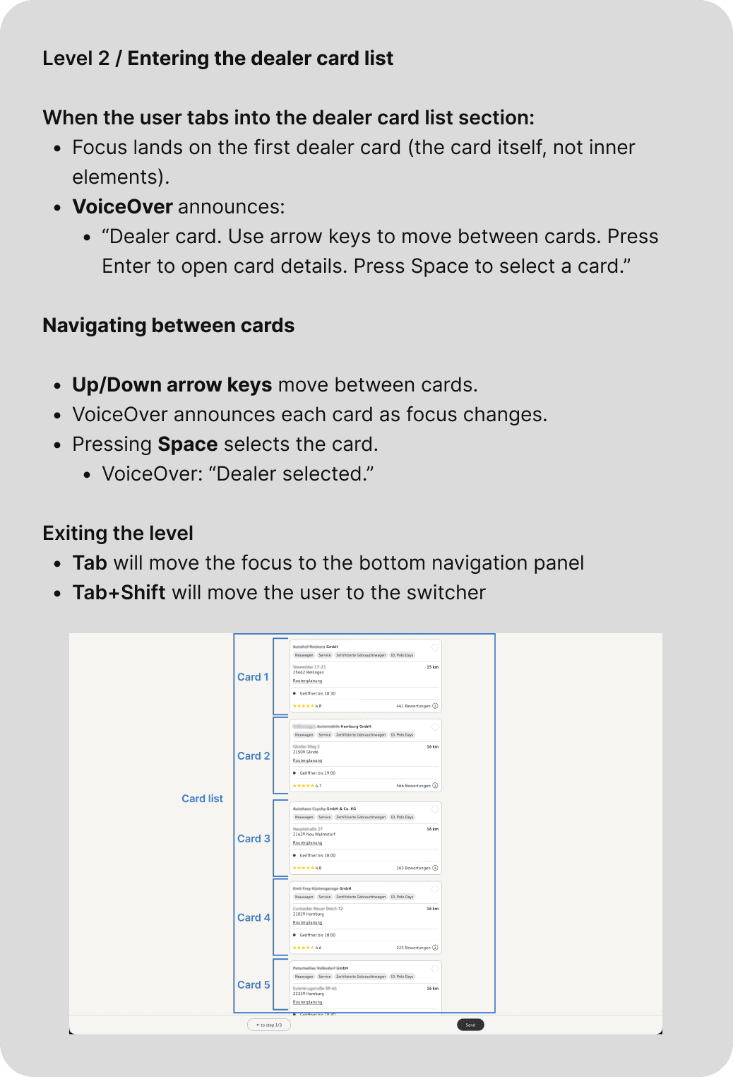
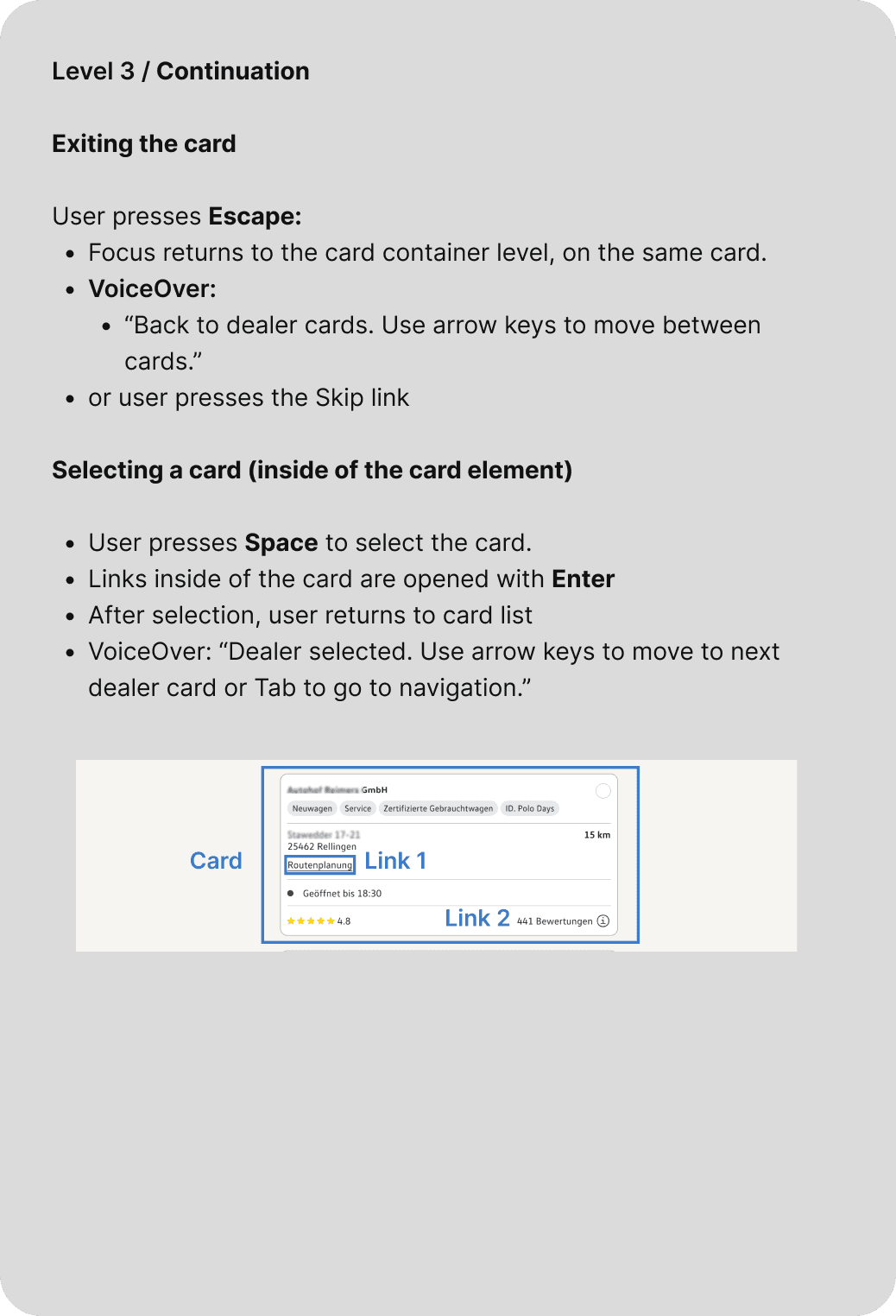
• Created a tab‑navigation solution capable of handling multi‑layered interactions, including an infinite card list with nested clickable elements.


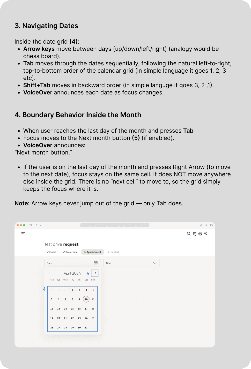
• Created a tab‑navigation solution for the calendar component.



Outcome:
The redesigned navigation model now provides a smooth, WCAG 2.2‑aligned keyboard experience across all major components, from infinite card lists to calendar interactions, significantly improving accessibility and reducing user friction.
Step 2:
Creating a Seamless Journey
Across the Entire Ecosystem
Product’s digital ecosystem spans dozens of product teams, yet users expect a single coherent experience. I reviewed the full end‑to‑end journey and ensured the experience remained consistent across all touchpoints.
What I did:
Improved supporting touchpoints
including confirmation emails, the summary page and the workflow of roll out managers when they set up the form.
Reworked UX copy
to replace long descriptions with concise, embedded microcopy, and set a consistent tone of voice across the entire project.
Aligned all screens
with the new Design System, updating visual language and color tokens.
Improved communication with the markets
and provided them with the tools to configure feature app components in the intended way.
Updated the Figma component library
to reflect unified patterns and components.
Collaborated across teams
to map cross‑product journeys, identify friction points, and propose layout standards to unify the experience.
Outcome:
Processes beyond the digital experience, both for stakeholders and customers, are now better aligned, creating a more streamlined end‑to‑end customer journey.
Scaling Good UX Across Global Markets
“Markets were given highly configurable components, but the abundance of options led to inconsistent configurations…”
What I improved:
Strengthened collaboration with markets to understand their workflows and identify where our support could improve the final product.
Created design guidelines in Confluence outlining how components should and should not be configured.
Introduced pre-configured component blocks to reduce misuse and ensure consistency.
Outcome:
Users can now move from one product area to another without feeling the boundaries between teams or systems.
Project Summary
Here’s a brief overview of the main challenges I encountered and how I addressed them:
The Challenge
• Stakeholders aimed to significantly boost the form’s conversion rate.
Impact
• 8% increase in form completion rate compared to the previous year. Reduced time to complete the form by 6 seconds. Improved user satisfaction based on post-test feedback.
• Legacy architecture created a patchwork of components owned by multiple teams, making changes slow and interdependent.
• Learned the state of each component and the project’s underlying architecture to ensure all design decisions accounted for technical realities.
• Setting up the new centralized Figma library became essential after the New Brand Design rollout and the Feature App updates.
• Created a new centralized Forms Design Library in Figma. WIP: Using AI, we began generating the code base for the Figma library to better support developers and get more experienced in code.
• Market‑specific configurations led to inconsistent setups that degraded the user experience.
• Developed relationship with stakeholders and markets, learned about their workflow and created documentation and pre-configured components to support them which led to fewer support tickets.
• Accessibility requirements called for an update to the new tab‑navigation pattern, and all components had to meet WCAG 2.2 Focus Not Obscured and Target Size criteria.
• Accessibility enhanced to meet WCAG 2.2 requirements.
Professional Growth
Professional UX, coding & interpersonal skills I developed during this project:
Data‑driven UX
used qualitative design metrics and qualitative design methods to track how my UX decisions affect the product.
Technical‑aware design and constraint‑driven problem solving
understood component architecture and constraints to design solutions within technical limitations.
Design system development and AI
built a centralized Forms Design Library and used AI to generate supporting code, strengthening collaboration with developers.
Accessibility compliance
understood what WCAG 2.2 consists of and how to apply it to the product.
Regulated markets
After working for the German market, I learnt how to design for regulated environments because every feature and piece of content had to pass strict legal, compliance, and accessibility checks before release.
Clear design communication
learnt new strategies to communicate design decisions in a clear, business‑aligned way.
Cross‑team collaboration
worked effectively across product teams and markets to align workflows.
Stakeholder & market partnership
built strong relationships, understood market workflows, and created documentation and components that reduced support tickets.
Strategic thinking
developed an ability to apply strategic decision‑making in a complex global ecosystem of the project.
Next Steps
A next phase would be deeper validation through usability testing and A/B experiments to confirm that the redesigned experience continues to meet user needs and business goals at scale.